In a recent issue of the Globe and Mail, I learned about a cool new, web-based app called visualize.me, which takes user data from LinkedIn and turns it into a customizable infographic résumé like this one I quickly created for myself here: visualize.me – Maria Loscerbo.
Some people believe conventional text-based resumes are too linear to describe information that is often non-linear. This software tool allows you to market yourself visually with a creative and interactive résumé that you can construct in less than 5 minutes.
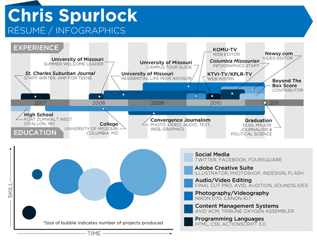
 With visualize.me, prospective employers can read about your work history in a dynamic and colourful flowchart complete with stylized sections that include skills, interests, testimonials and relevant career statistics. The creator of this app was originally inspired by the infographic resume of writer Chris Spurlock. This resume (shown above) garnered high profile media coverage around the world and, eventually, a journalism job at Huffington Post.
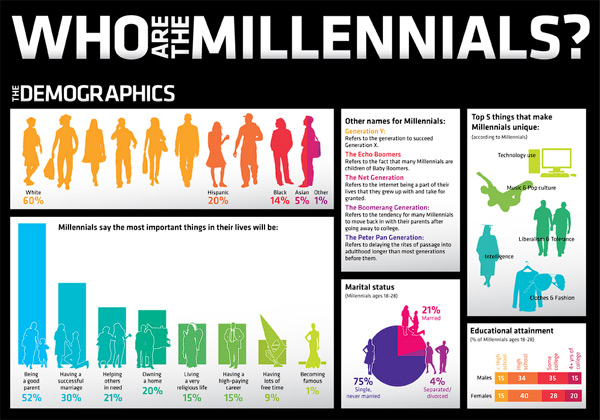
I am a huge advocate of infographics for PR purposes! Not only are they a quick way to graphically convey key information but they are a helpful visual aid for time-crunched people who want the top line facts in about 10 seconds.
The next time you watch the 6pm news, pay attention to how TV news programs regularly display infographics during broadcasts. Producers do so because it’s a useful, quick way to visually depict a story’s highlights to viewers.
 Newspapers and magazines use infographics too and will often have their graphics department create custom graphics to accompany an editorial piece or feature story.
Here are two good examples published in the G&M recently: this infographic was used in a story to communicate Target’s expansion to Canada, and this one was used to provide an overview of Canada’s beer market.
Typically when a photo or graphic accompanies a print news story, it means a bigger story and more ink for the company being profiled. It means readership will be significantly higher compared to a story that does not contain any imagery; hence, it creates a bigger overall impact with readers and likely higher ROI for the company being featured.
While I’m a big fan of infographics, which are also often used in corporate communication materials such as annual reports and PowerPoint presentations, keep in mind that a clever visual display should be more than just pretty-looking artwork. It should be meaningful. It should make a difference. It should be used to supplement conventional collateral materials, not replace them.
Infographics are not meant to hide any relevant details or content but merely help those get a sense of what you’re trying to convey in less than a minute.
To view more resume examples and trends in infographics, click here. If you want help creating your next infographic, contact me anytime. - Maria Loscerbo

monmorong
Oct 26, 2011 -
You are an excellent writer Maria! Great blog on the usage and power of Infographics. I just Stumbled it for you too. Thanks for sharing!
breannakatelynn
Dec 3, 2011 -
Great post! I am a fan of your articles. I especially love a good infographic- it just work in a way that words can not sometimes. There is so much room for creativity visually with these tools. I also think you made a good point about meaningfulness. As good as these infographics may be, if there is no depth, it is all in vain. So glad you posted this. Thanks again,
Katie
Blog Comments- Professional | Simply PR.
Dec 3, 2011 -
[...] Blog Link [...]